Pages

Showing posts with label Design. Show all posts

Thursday, February 9, 2012


Menu design for Elephant Cutlet.

Really looking forward to consuming some crème anglaise, haven't had enough of that stuff in my life so far. And the sausage - it's homemade and probably being made as we speak at Windsor meats - so cool!

You cominggggg?

Elephant Cutlet

Sunday, February 5, 2012


Alex and Ken are doing a pop up restaurant at a space over by Crab Park. It's called Elephant Cutlet and the name and concept was inspired in part by this. They were really inspired by Ludwig Bemelmans, the author/illustrator of the cute little Madeline books. This is my sort of homage to Bemelmans. I think this poster is really funny - the shapes are supposed to be really abstract pieces of meat, one of them kind of looks like a severed elephant trunk, but I was more going for a rack of ribs.

Also, I think it's worth showing the other direction that I proposed for the poster:

This is the more elegant, sort of mysterious version - because the dinner is a pop up and at a sort of obscure place. But the boys chose the first direction - wanting to be whimsy and getting away from the "coolness" typically seen in design in the restaurant industry.

Fine by me!

Anyways - come out to the dinner - it's simple, delicious home food and it'll be really cozy and affordable - and oh yah, I'll be there and it be nice to see your faces!

A Most Curious Event

Sunday, November 27, 2011


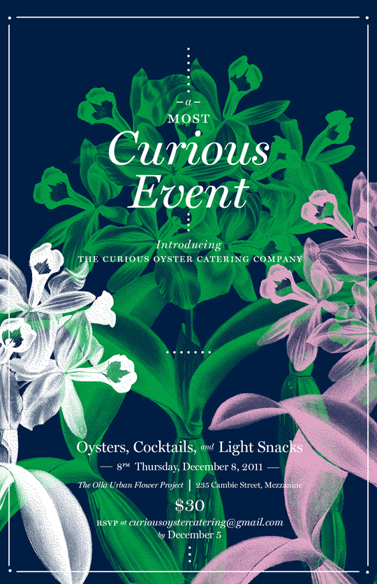
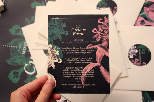
Poster design I did for Curious Oyster Catering Company for their upcoming event, A Most Curious Event at Olla Flowers. It sounds like it's going to be a really nice night, flowers everywhere, and oysters! Gawd, since becoming a vegetarian, I have really singled out the meats that I miss, and oysters is definitely one of them. I could eat dozens in one sitting and not feel disgusting. I'll probably cave at this event and eat a bunch - JOIN ME!

Ahem, the invites:


If you want to go, RSVP at curiousoystercatering@gmail.com!

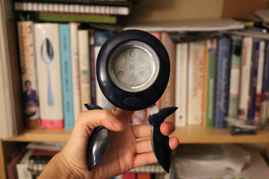
Speaking of curious things, get a load of this punch that I bought to cut out the circles for the invites:

Whooaaaaa, isn't this thing the funniest/craziest? So massive for doing one task. But I gotta say, this thing, it has a LIFETIME WARRANTY and has the "Ease-of-use Commendation" by the Arthritis Foundation. This thing punches like a dream, I have never had so much satisfaction/fun from making circles out of paper.

!!

Someone give me a project that needs 2 inch circles, I've got just the thing.

Fish Bowl

Sunday, November 6, 2011

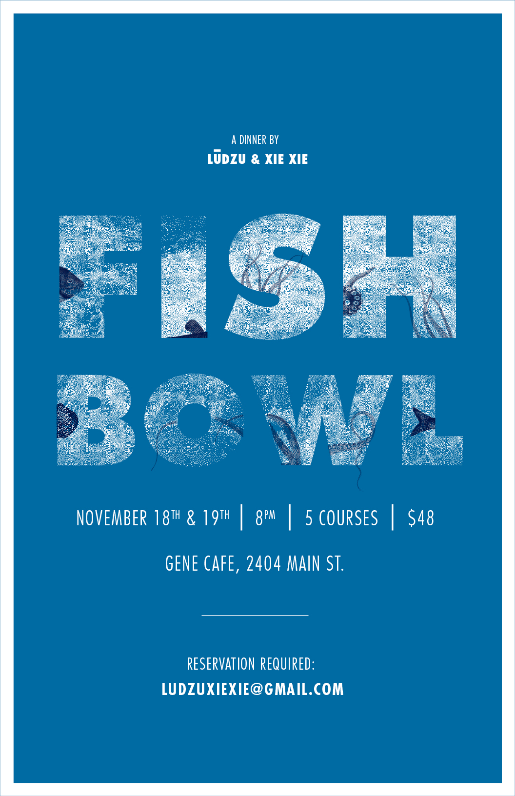
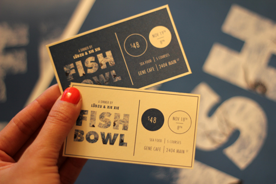
Ken Tsui and Alex Dadzis are putting on another dinner, a seafood one at Gene Cafe on November 18th and 19th! Go! Even if you don't like seafood, I think they'll convince you otherwise. Contact them at ludzuxiexie@gmail.com to reserve your spot or ask questions about the sea!

Here's the poster and ticket design I did for it:


The sea!

a reminder:

Saturday, September 10, 2011


It's always hard to remember that the end of something is the start of an opportunity. And that it's from there where you see what you're made of and that discomfort will make you something more if you try.

Thanks summer, twas swell. Hello fall, hope you're glad to see me.

the only one.

Monday, May 9, 2011


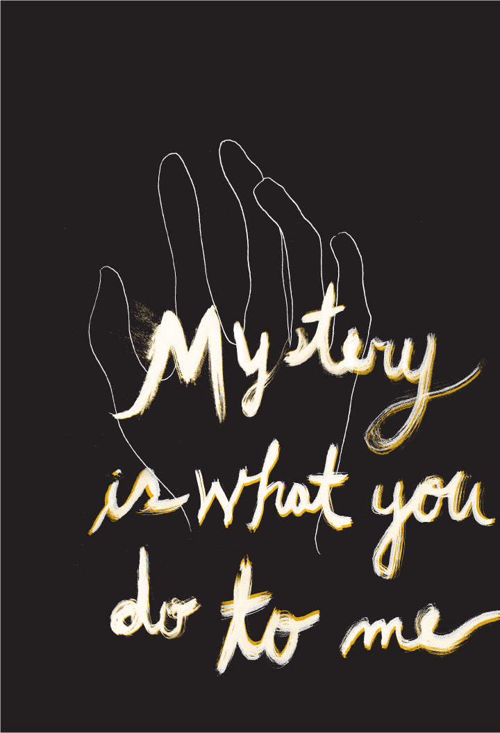
I thought this was a line from the Black Keys song (The Only One). Turns out I heard and remembered it slightly wrong (it goes, "Mystery is what this is to me"). I like my version better though. MORE ROMANTIC.

loved it more than anything, loved everything more than anything.

Tuesday, May 3, 2011

No Buddy Trusts Me Anymore

Thursday, March 17, 2011


Yoooo, here's a poster I did for this guy. The show is opening this Friday at Anti Social and is on till April 19. He is sleeping hard on my couch right now (he was up 2 days straight preparing for this show, so anyone who is in Vancouver and is friends with me or him or possibly likes art and/or nice experiences, come out!)

for everyone and anyone on february 14:

Sunday, February 13, 2011


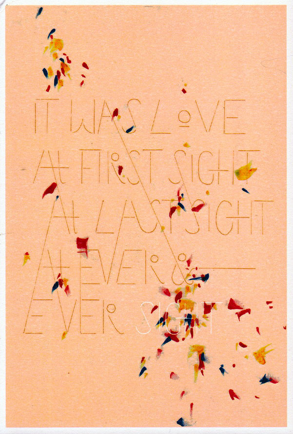
It was love at first sight, at last sight, at ever and ever sight. -Vladimir Nabokov, Lolita.

Books Read '10

Monday, January 3, 2011


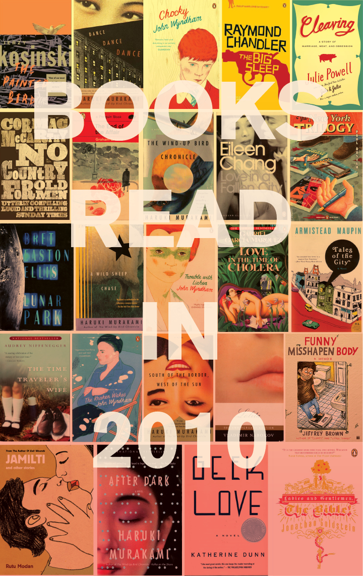
Books I read in 2010 (in the order seen in the above image):

The Painted Bird by Jerzy Kosinski
Dance, Dance, Dance by Haruki Murakami
Chocky by John Wyndham
The Big Sleep by Raymond Chandler
Cleaving: A Story of Marriage, Meat, and Obsession by Julie Powell
No Country for Old Men by Cormac McCarthy
The End of the Affair by Graham Greene
The Wind-Up Bird Chronicle by Haruki Murakami
Love in a Fallen City by Eileen Chang
The New York Trilogy by Paul Auster
Lunar Park by Bret Easton Ellis
A Wild Sheep Chase by Haruki Murakami
Trouble with Lichen by John Wyndham
Love in the Time of Cholera by Gabriel García Márquez
Tales of the City by Armistead Maupin
The Time Traveler’s Wife by Audrey Niffenegger
The Kraken Wakes by John Wyndham
South of the Border, West of the Sun by Haruki Murakami
Lolita by Vladimir Nabokov
Funny Misshapen Body by Jeffrey Brown
Jamilti and other Stories by Rutu Modan
After Dark by Haruki Murakami
Geek Love by Katherine Dunn
Ladies and Gentleman, The Bible! By Jonathan Goldstein

Out of all of these books, if you need something to read, I’d say: No Country For Old Men (Texas Noir, aka, such a badass book) by Cormac Mccarthy, The Time Traveler’s Wife by Audrey Niffenegger (especially if you want to cry), Geek Love by Katherine Dunn, Jamilti by Rutu Modan, and man, I read a lot of Haruki Murakami books, which were all enjoyable, but I’d say, Dance Dance Dance takes the cake. Ha, all my recommendations, you’ve probably read them anyways, but they’re good books aren’t they?!

I didn’t like Tales of the City so much, as detailed here, and I was pretty disappointed with The Kraken Wakes and the Trouble with Lichen by John Wyndham, mostly because I thought they would be so good (as some of his other books are), but they were just so disappointingly boring.

BOOOOOOOOOKS!!

harry, you're all right.

Wednesday, December 1, 2010

What oh what have I been doing?
Humming away at Adbusters, the latest issue, the January/February 2011 Big Ideas issue just came out.
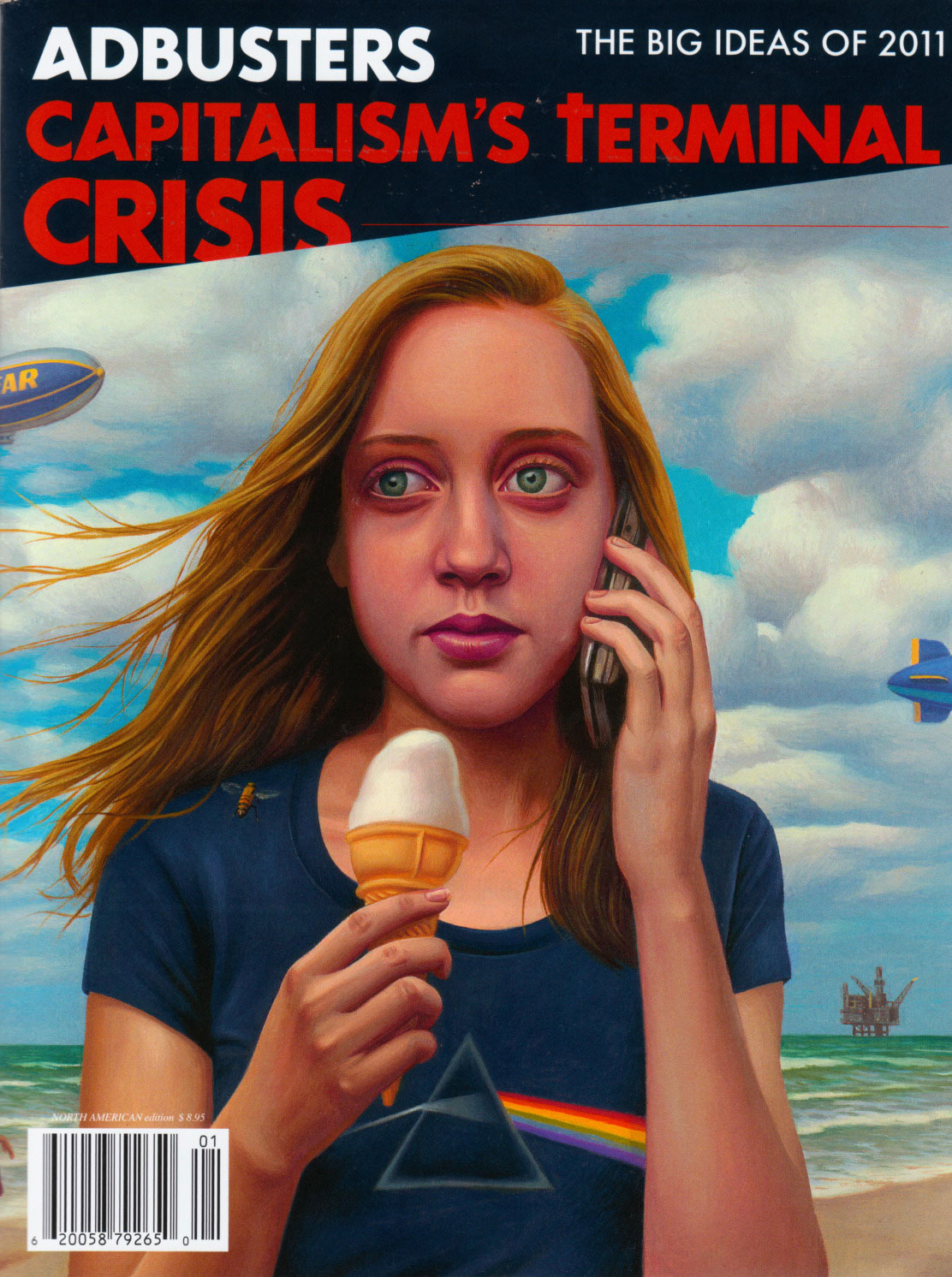
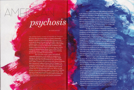
A few spreads I designed:
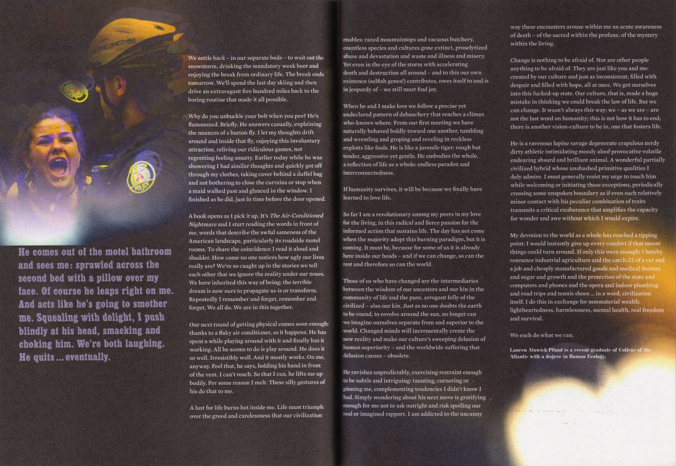
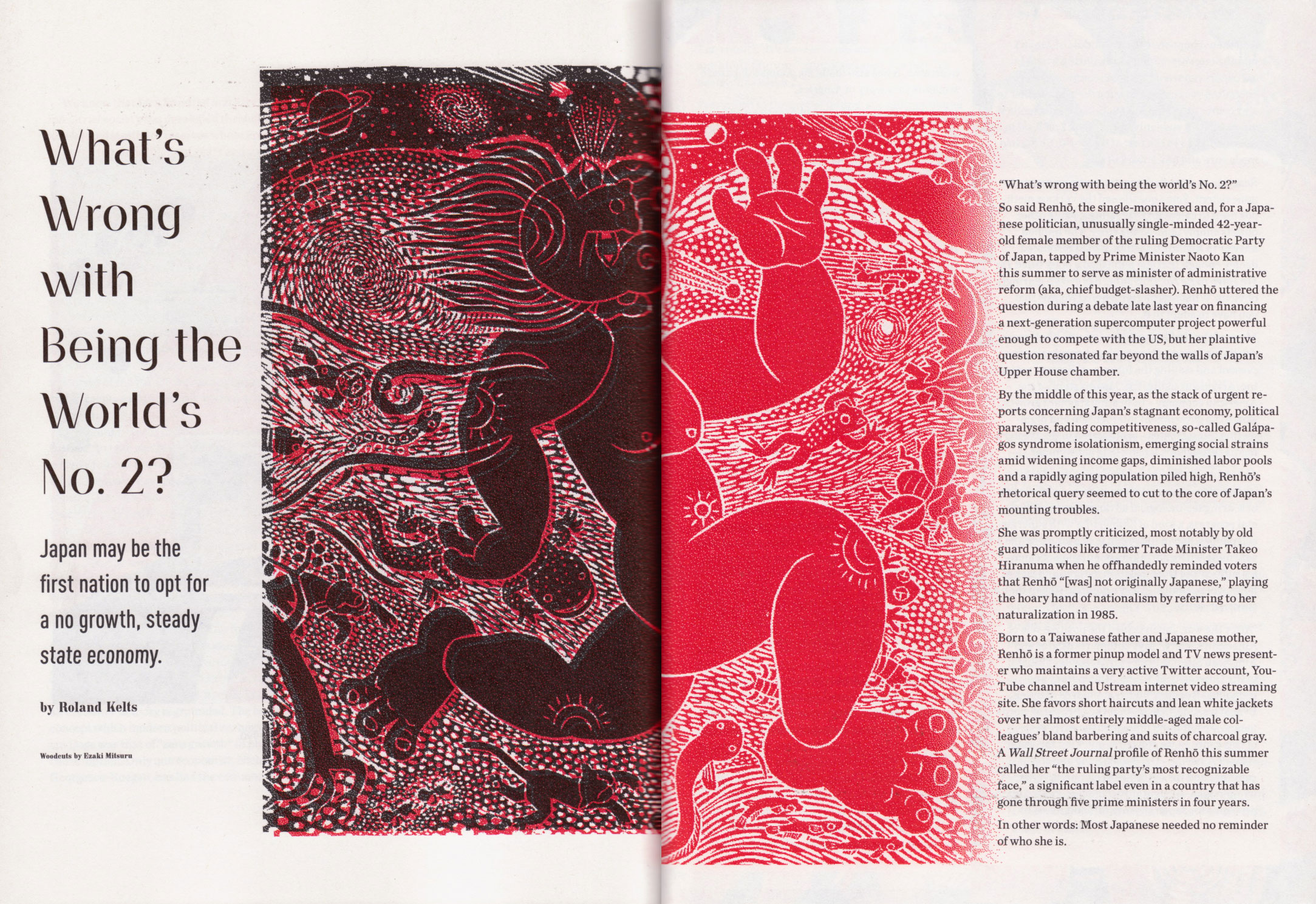
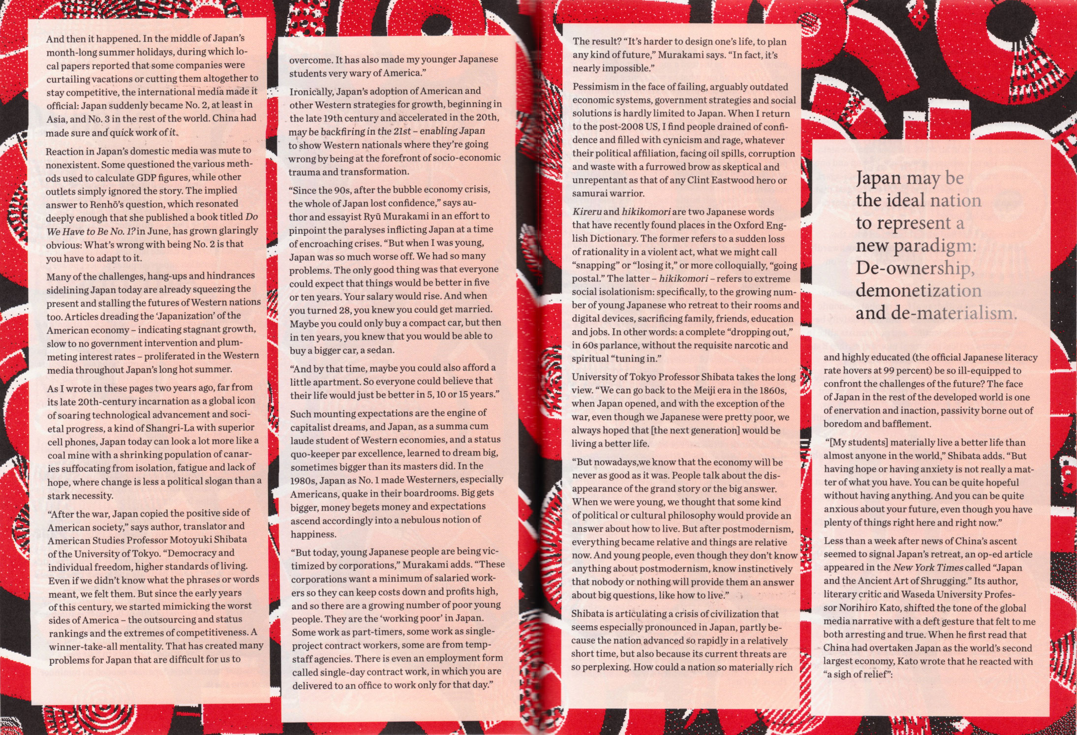
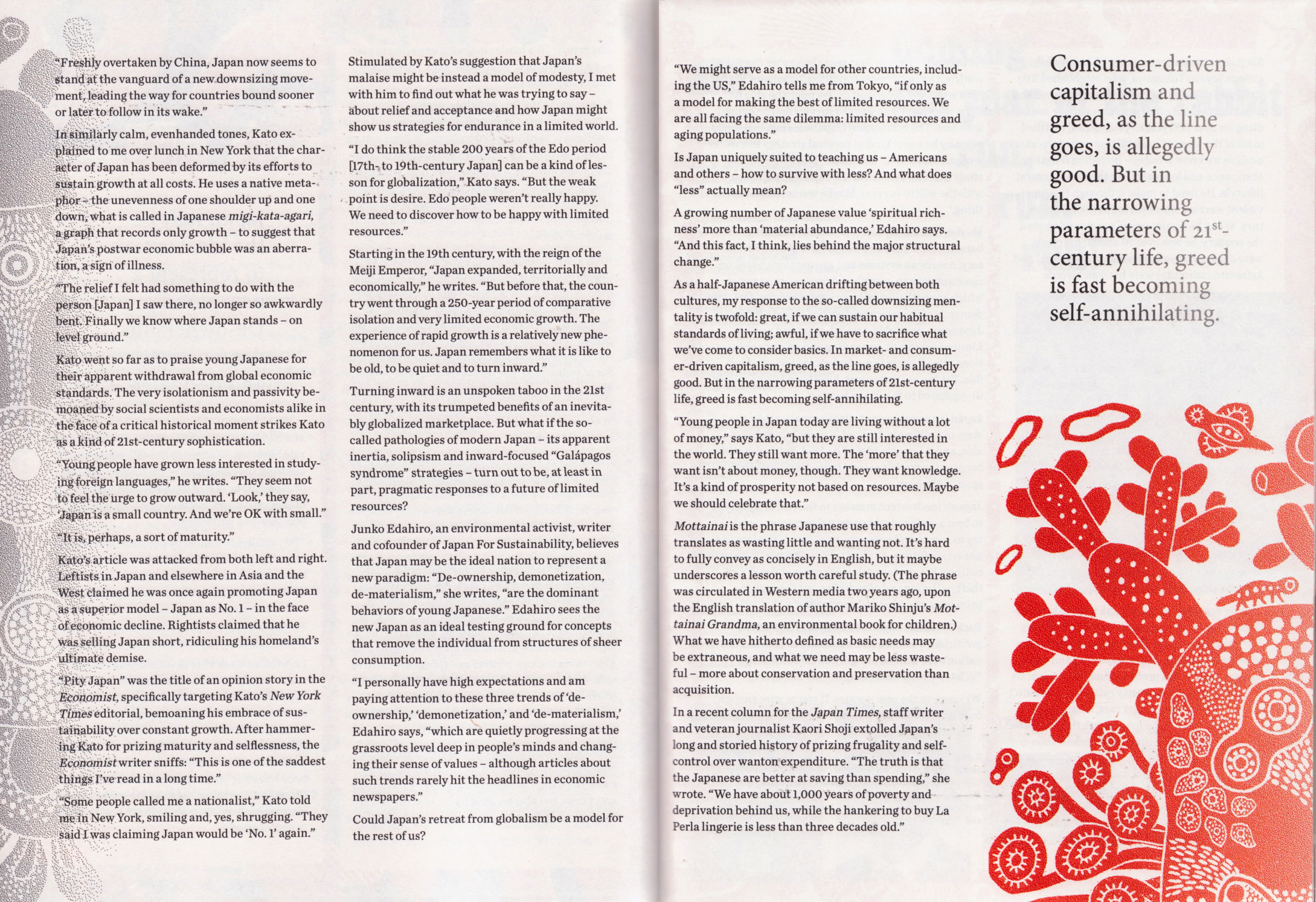
This issue was the 3rd and final issue in the Adbuster's Revolution issues (Issues about Revolution, giving a history of it, and what kinds of revolutions are happening now and could happen in the future). The visual themes tying this issue together was light and colors (yes, I know, really broad metaphors, but it did help narrow down how to approach designing these spreads). So the issue goes from dark colors (Indigo, Violet) and transitions on through to angrier colors (Red) and into calmer more poetic ones (Green, Yellow). With each corresponding colors, the stories of the magazine follow the same sort of feeling, so dark stories at the beginning, and revolutionary, activist stuff in the middle, and ending on more thoughtful and quiet ideas.

I used so many bitmaps and what seemed like the first time ever, gradients. Have never used so many gradients in all of my time designing, always kind of thought they were slightly ugly and cheesy looking, but erm, I've changed my mind. GRADIENTS!

So yes, go look at the issue, and...buy a copy. It's a good issue.

Other things I've been doing, and this is kind of Adbusters related:

Being number 1 in the office Fantasy Football. :) :) :) :) . Although I did lose last week, a pretty brutal loss, 200 points to my 140 something points. That team was insane though. Let's hope that none of the other teams are as insane in the next 4 weeks, cause then...I'LL WIN!
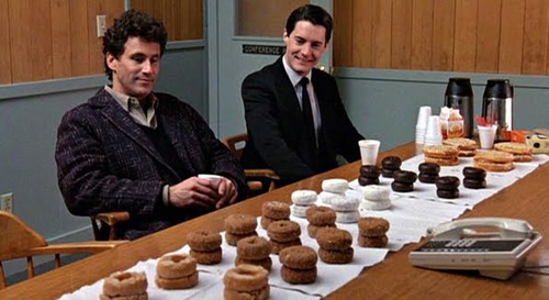
Just started watching Twin Peaks. Man I really like it. Endearing townspeople with dark secrets. SPECIAL AGENT COOPER! Holy crap Kyle Machlachlan. Did you know he has a vineyard? And keeps a blog for his dogs? And takes on the strangest and most varied roles? Like really good ones like Special Agent Cooper in Twin Peaks and then stuff like the villain in the live action movie The Flinstones (I know this because for some reason I watched this movie over and over when I was a kid) and as Charlotte's first husband in Sex and the City? He didn't want to be type-casted I read somewhere. Yep, I think you've got that covered Kyle. Also I really love the theme song of Twin Peaks. It has the most cheesiest bass line, and it is slightly creepy, but man it is good.

I was walking home with Will (the art director at Adbusters) and I told him I've started watching Twin Peaks and he said that a lot of people when they're at my age watch Twin Peaks. I asked why. And he said he didn't know, just that they do. And I can see that being true. All 23 year olds, watch if you haven't, you can appreciate this donut image more.

I leave for Calgary in a couple of weeks. I was passing by an apartment and I could see their Christmas tree, and I don't know! It instantly made me fall in love with Christmas! Or at least start to get really excited and into it, and now all these Christmas related things are popping up that are making me fall in love with it even more, like, CHEESE BALLS! I haven't had a cheese ball in so long! I LOVE CHEESE BALLS! Here is a place that has a couple of interesting recipes for them: http://homesicktexan.blogspot.com/2008/12/cheese-logs-cheese-balls-and-aunt-betty.html

Anyways, that's the long and short of what I've been doing, working at Adbusters, killing the football pool, watching things, and eating and dreaming about cheeseballs.
away, away, away.

Tuesday, November 16, 2010


I need to remember to bring my camera around with me more.

And FYI:

Thanks Jane.

The Eye of the Storm

Monday, October 4, 2010


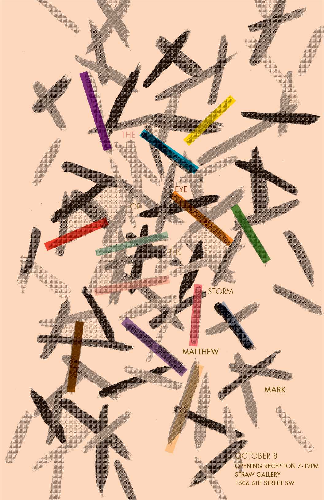
A poster I did for an upcoming show at Straw Gallery (this friday, also my brother's birthday, also thanksgiving weekend!), Matthew Mark, "The Eye of the Storm". I think you can see more of his work here. I really liked Matthew's colorful wooden sculptures, and I was told that he would be exhibiting some paintings at this show, so I painted a probable Matthew Mark sculpture and it was nice to paint colorful strokes on top of one another (although you can't really tell so well from the poster).

In other news, I am on the most hilarious winning streak in my fantasy football league. I did however have to let go of my kicker (he wasn't playing this week), the only sad news about this otherwise very funny/fulfilling endeavor that is proving to be so entertaining.

undeniable.

Friday, September 17, 2010


I feel like I haven't done personal work in a long while. I always want to and felt like it but could never really bring myself to do it. It's like when you feel like talking and you want to have a great conversation but you have nothing to say. Or you really feel like cooking but you can only find shitty non-interesting recipes. Or you want to read a really good book but everything seems boring and long. Or you want to see a really good movie but you've seen a lot of the good movies and begin to get indecisive with the amount of choice thereafter (mystery, drama, romance, comedy, sci fi, and so on). I am hoping that while all this wanting and then not doing anything, that even though I'm not doing something, that I'm at least absorbing whatever is happening so that when it finally comes time that I make something, eat something, read something, watching something, talk about something, that it is somewhat informed and fulfilling and if I am lucky, meaningful.
I've also had a hard time with the idea of making stuff. Where does it all end up, what's the point, etc, etc. And I still have a hard time with it and maybe that's part of the satisfying thing of making something of your own, working through these personal misgivings and at least coming out with something. Something that is yours.

And this here, is mine.

Selected, Recent, & Very Here: Ideas

Sunday, July 4, 2010


I designed Sean's artist statement for his upcoming show, "Selected, Recent, & Very Here: Ideas" at the Coup restaurant in Calgary opening on July 7. Go if you're in Calgary!

Also, Sean has started a blog: seanmacalister.blogspot.com

Another update: my favorite dessert these days: whipped cream with a bit of a maple syrup and fresh bc cherries. gawwwwdddd! 

And my favorite thing to do: nothing.

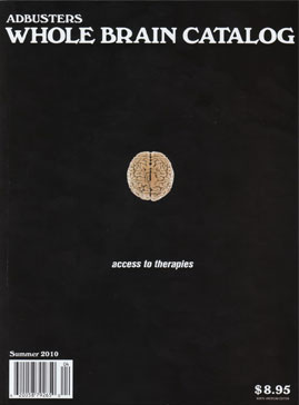
Adbusters 90: The Whole Brain Catalog

Tuesday, June 8, 2010

So since starting at Adbusters, the first issue I got to work on is out on newsstands now:
The theme of this issue, "The Whole Brain Catalogue" was inspired by The Whole Earth Catalogue. The Whole Earth Catalog came about from a guy who was high on LSD back in the 70s or so and was starting out at the sun and (up until this point there was no image of the whole earth) and thought it was weird that there wasn't an image of the whole earth, and I guess somehow he got it to happen, or at least got the ball rolling, and then this catalogue came about where it sells items that hippies would like.

Anyways, this Adbusters issue is showing the whole brain and things to do with the brain. The visual theme of the issue was "madness". 

I had first discovered Adbusters in high school and was immediately influenced by the anti-corporate and consumer ideas and really took it to heart (but got kind of disillusioned with it shortly thereafter, I like to spend money and not be told in an aggressive way how to spend it). I was also truly inspired by the way the pages were laid out, even going so far as to try to do that in whatever sort of projects at school I could. I liked the hand done aesthetic and the aggressiveness of the design and it really (unknowingly) shaped my design process.

So it is super funny and interesting that I ended up working here. If you had told me in high school I'd be at Adbusters, I'd be like, no way! I didn't even realize back then that being a designer, laying out these pages, was a JOB, and that it was done by a PERSON. This was naive of me, but Adbusters was just this magazine, that just magically produced itself, and was done in some far off place that I would never be able to touch.

But here we are.

Working on this issue was exciting for me. It was my first time working on a real publication in a real job setting that was going to be seen by people. It was interesting to see the process of making this magazine and I have never used so much of the scanner, photoshop, and bitmaps in my life. My role in this magazine was, that the art director (Will Brown) would assign me pages/spreads/elements of a page to work on and to really just go crazy with the layout (aka do what I want but still get across the message of the piece). On all of the things he assigned me, the image was chosen by himself and the text was provided, and I just did the rest. 

The aesthetic of Adbusters, from what I gathered, is that they did not want any sort of visual fatigue. They want all kinds of styles on all different pages, and this creates a visual onslaught that can be either stimulating or overstimulating (so much so that you stop reading), depending on who you are. Before I had thought Adbusters was overly aggressive, and it still is, but I've gotten used to the craziness of the pages. Another thing was, if you have a crappy resolution on your image, or if you suck at photoshop, you can either a) try to learn better tools in photoshop, find a better image, and make it look pro, aka, find a pro solution or b)  acknowledge the crappiness and your limitations and play it up. That was really interesting to me, both of them are solutions/approaches to a problem, but I had never thought in those ways before, the goal for whatever you are trying to design, for me at least, is to make things look as tight as possible, to address and acknowledge crapiness is something I've never considered before. 

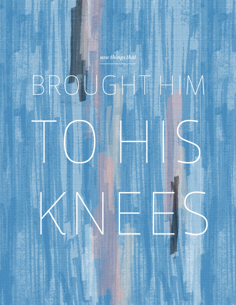
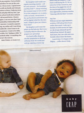
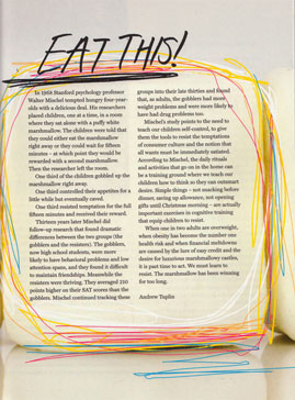
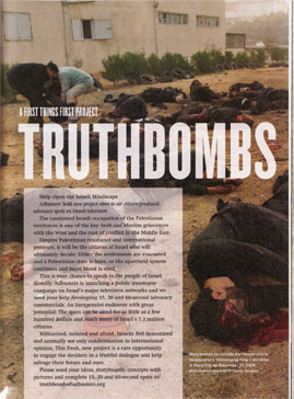
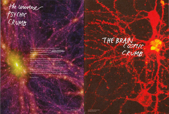
You'll see a lot of my handwriting in this issue. Angry handwriting. Here are some pages/spreads that I worked on that I liked:

The funniest thing I had to do for the magazine.


Check out the issue, yah?!

Easter & Such.

Sunday, April 4, 2010

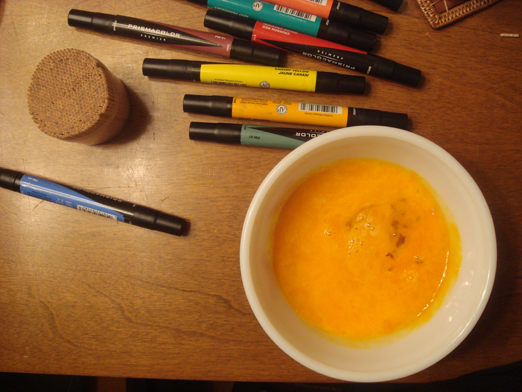
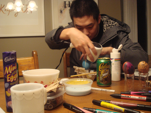
So on a Friday night, with nowhere to go out to, Andy, Tom and I made Easter eggs.

lol.

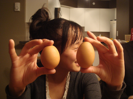
Different egg shapes.

In case you didn't know the difference between a normal egg and a mini egg, here is a picture to aid you in your learning.

Couldn't turn this into an omlette or something, too much spit and who knows what else.

lol @ Tom's drying setup.

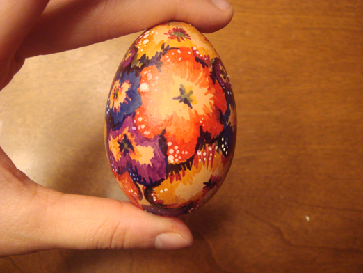
The eggs!

Mine.

I liked Tom's postmodern colorful egg.

And also Andy's typographic egg.

So I got to design the latest issue of the One Cool Word Magazine. I am pretty happy with the result, and there are some pals showing their work in this issue, Nathan Grimson and Keith Weiss! So you can pick up a copy of this at the launch party (which is included in the door price-$10-flyer below, designed by co art director and designer Jaz Halloran) which is happening a couple of weeks from now. The launch seems like its going to be interesting, burlesque dancers (I've never seen them before!), artists featured in this magazine will be exhibiting work, bands, and I imagine beer. Wooo. SO COME! PLEASE!?!

five full seconds.

Wednesday, March 31, 2010


Phew March.

This month was moving along at a pretty...slow pace and then all of the sudden things have gotten very busy. At times I feel like a chicken running around with my head cut off, but I am grateful for not sleeping in until 12pm and then spending an hour to figure out what to do with my day. I don't do well with that amount of time on my hands.

I've also always felt that I am better in the Spring. I always feel like I make most of mistakes, am at my worst in the fall and winter, and then somehow Spring always works out for me. Maybe that's why it's my favorite season. And also the air smells nice.

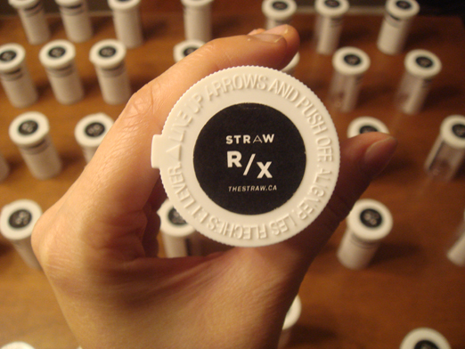
One thing that kept me busy this past weekend (for Straw):


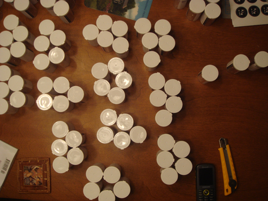
Holy crap those circles for the tops killed my hands to do. I made it so hard for myself and there were moments where I just held the little labels in my hand and just wished it would just unstick itself. But I'm not a wizard, so oh well.

At the beginning of this month I watched...hahaha 3 seasons of Lost straight (I had lots of time as explained before). And there was this part where one of the characters, Jack, a spinal surgeon, was telling this other character Kate about this time where he was doing surgery on a patient and he screwed up really bad. He was scared, and he said to himself that he will give himself 5 seconds to let the fear completely envelope him and when those 5 seconds are up, to get back to what he is doing. I have been thinking about that a lot lately. Not just in terms of fear, but in any sort of extreme negative emotion, like boredom, annoyance, being tired. I think it's a good way of putting things behind you, letting everything hit you for a brief amount of time in order to move on. Because people and things need you to get on with things, you need yourself to get on with things.

Anyways.

Hi April, nice to see you.

some of it:

Thursday, March 25, 2010

Hmm I was going to wait and make a long epic post after I finished a lot of things that I have on the go, but I am too excited and really want to show you some of it now:
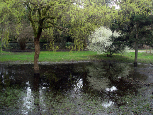
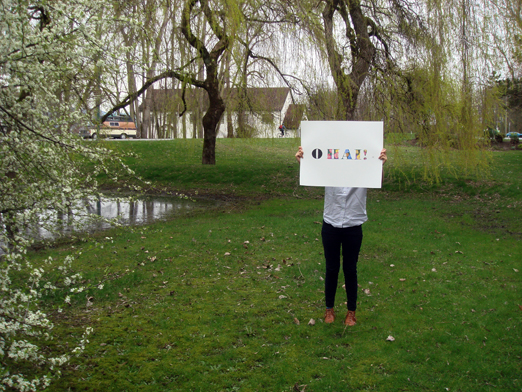
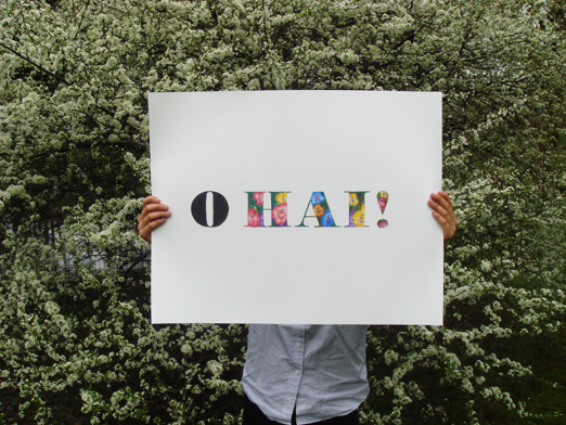
Andy helped me photograph this. Woop thanks Andy. I wanted to photograph it on a nice day, and I had researched it and everything, SATURDAY WAS SUPPOSED TO BE SUNNY! But it was overcast, but whatever, first day of spring, it's a hard day to live up to, so I understand Spring if you just weren't up to being awesome on your first day. You're still my favorite season hands down.


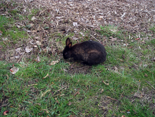
Aw my gawwwd, LITTLE HILLS WITH LITTLE BUNNIES! Okay Andy and I did the photos at Jericho and as many people in Vancouver know, there are many rabbits there, and in so many different colors (grey! white! caramel! dark brown!) and they are so incredibly cute and we watched them for a bit and I can't wait to go see them again. 

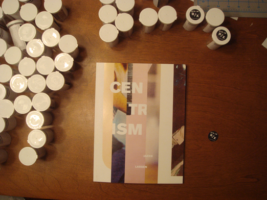
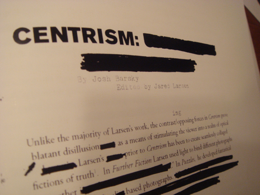
And hooray! The book I designed (Centrism) for Jared's collages is done! If you'd like a copy, you can contact Josh at strawbooks@gmail.com.

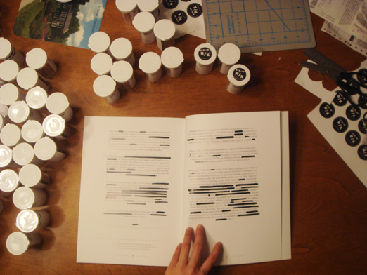
I am especially happy with the accompanying essay at the end and how it was treated:
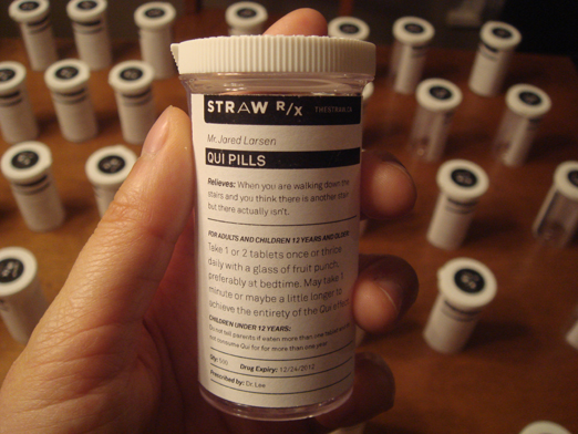
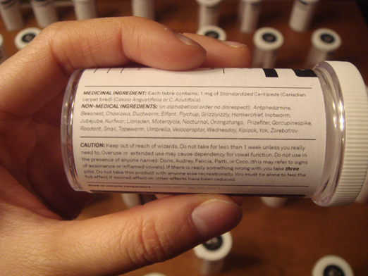
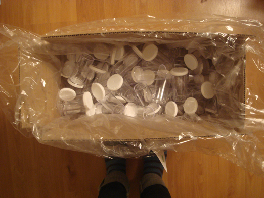
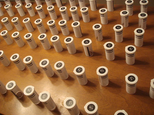
Another project that I am working on for Straw. It's a pill bottle that treats...when you are walking down the stairs and you think there is another stair but there isn't. The whole idea stemmed from Jared and Josh when they were thinking of what to submit to a friends' magazine, Palimpsest for their second issue, Medicine. So it was kind of funny, we only needed 50 bottles for the project, but Shoppers Drug Mart (where I bought these from), would only give me...200. So the rest of them will be sold at the book launch for Jared's book which is happening April 2 at Comrad Sound in Calgary, AB. So yeah I am busy trying to get like 1oo of those done with my impatient and clumsy hands (but don't worry! They don't look shitty! I think at least!)


Okay that's it and I hope you are well as well.