So since starting at Adbusters, the first issue I got to work on is out on newsstands now:
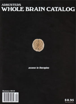
The theme of this issue,
"The Whole Brain Catalogue" was inspired by
The Whole Earth Catalogue.
The Whole Earth Catalog came about from a guy who was high on LSD back in the 70s or so and was starting out at the sun and (up until this point there was no image of the whole earth) and thought it was weird that there wasn't an image of the whole earth, and I guess somehow he got it to happen, or at least got the ball rolling, and then this catalogue came about where it sells items that hippies would like.
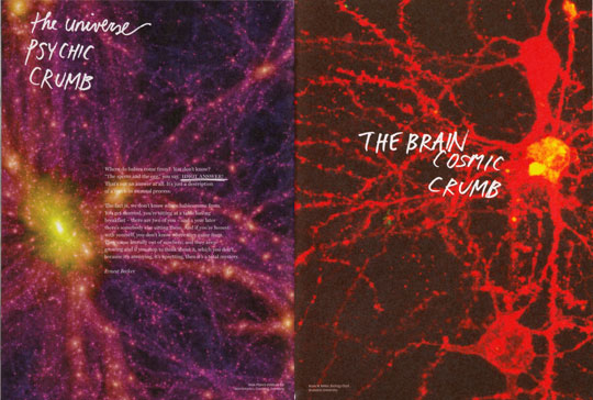
Anyways, this Adbusters issue is showing the whole brain and things to do with the brain. The visual theme of the issue was "madness".
I had first discovered Adbusters in high school and was immediately influenced by the anti-corporate and consumer ideas and really took it to heart (but got kind of disillusioned with it shortly thereafter, I like to spend money and not be told in an aggressive way how to spend it). I was also truly inspired by the way the pages were laid out, even going so far as to try to do that in whatever sort of projects at school I could. I liked the hand done aesthetic and the aggressiveness of the design and it really (unknowingly) shaped my design process.
So it is super funny and interesting that I ended up working here. If you had told me in high school I'd be at Adbusters, I'd be like, no way! I didn't even realize back then that being a designer, laying out these pages, was a JOB, and that it was done by a PERSON. This was naive of me, but Adbusters was just this magazine, that just magically produced itself, and was done in some far off place that I would never be able to touch.
But here we are.
Working on this issue was exciting for me. It was my first time working on a real publication in a real job setting that was going to be seen by people. It was interesting to see the process of making this magazine and I have never used so much of the scanner, photoshop, and bitmaps in my life. My role in this magazine was, that the art director (Will Brown) would assign me pages/spreads/elements of a page to work on and to really just go crazy with the layout (aka do what I want but still get across the message of the piece). On all of the things he assigned me, the image was chosen by himself and the text was provided, and I just did the rest.
The aesthetic of Adbusters, from what I gathered, is that they did not want any sort of visual fatigue. They want all kinds of styles on all different pages, and this creates a visual onslaught that can be either stimulating or overstimulating (so much so that you stop reading), depending on who you are. Before I had thought Adbusters was overly aggressive, and it still is, but I've gotten used to the craziness of the pages. Another thing was, if you have a crappy resolution on your image, or if you suck at photoshop, you can either a) try to learn better tools in photoshop, find a better image, and make it look pro, aka, find a pro solution or b) acknowledge the crappiness and your limitations and play it up. That was really interesting to me, both of them are solutions/approaches to a problem, but I had never thought in those ways before, the goal for whatever you are trying to design, for me at least, is to make things look as tight as possible, to address and acknowledge crapiness is something I've never considered before.
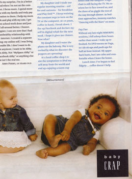
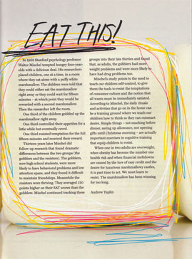
You'll see a lot of my handwriting in this issue. Angry handwriting. Here are some pages/spreads that I worked on that I liked:
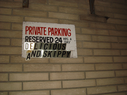
The funniest thing I had to do for the magazine.
Check out the issue, yah?!